Pfeffer Simpelgotisch – suited for display of old and new things.
Pfeffer Simpelgotisch is a particularly simple variant of the textura — that blackletter scripture which, starting from the 11th century with the advent of the Gothic style, had evolved from the Carolingian minuscule via the Gothic minuscule. The prevalent typeface of an age roughly reflects the era’s architecture: The Carolingian minuscule’s roundings correlate to the Romanesque round arches, while the textura’s letters are as peaked and as upright as Gothic architecture. Sans-serif on the contrary breathes the spirit of our concrete age, and antiqua is apparently to stand for anything in between, from Renaissance to Classicism. Following this finding, the pointed arch is the essential stylistic feature of Pfeffer Simpelgotisch, which for the rest is quite unornamental.
Blackletter typefaces know two forms of “s”— the round one (“s”) and the long one (“ſ”)— the use of which abides by certain rules. Moreover, they use ligatures, including some mandatory ones. Pfeffer Simpelgotisch’s very special feature now is its having ſ and s as well as the ligatures automatically set, provided that the employed software supports OpenType features:


(“blimp airline’s captain’s hat”)
This, as well as its high legibility in small type sizes, renders Pfeffer Simpelgotisch even suitable for use as a system font in browser or operating system— at least on fast computers.*
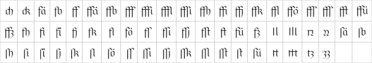
Pfeffer Simpelgotisch contains more than 500 glyphs the whole of which can’t be displayed here. These include many accented glyphs and other special characters. As far as the coverage reaches, the character mapping follows the recommendations of the Medieval Unicode Font Initiative. Particularly noteworthy are the numerous ligatures that are all set automatically.
Up to now Pfeffer Simpelgotisch is available in three typefaces: regular, semi-bold and bold. As Microsoft Word doesn’t recognise semi-bold typefaces so far, I also offer the semi-bold one as a separate file in which it is declared as a separate font family.
Pfeffer Simpelgotisch makes extensive use of OpenType features. The features “clig” and “liga” ought to be activated by default in order to have ſ and s as well as the ligatures automatically set. In detail:
I’ve used the feature “clig” (contextual ligatures) to store the rules for the correct setting of ſ and s. Ten European languages are supported. The language properties assigned to a text (e. g., in a Word or HTML document) determine which body of rules be applied. According to German rules, s is set at each syllable’s end, subject to some exceptions. In any other case ſ is set. While this rule sounds simple, it’s quite complicated to teach a machine what a syllable is! Very few abstract and universal policies were to be found, and so the German rule body couldn’t be prevented from dwindling into casuistry. Hence, about 90 % of the “clig” feature is occupied by the German rules, while the other languages get along with the remaining 10 %. I’ve to thank Hans Georg Soldat †, the author of the Ligaturix, who kindly had given me a long list of tricky words. Alas, he has just died a few months too early to hear from my finished font.
The Dutch rules are experimental. Setting ſ and s in Dutch is as complicated as it is in German, and I lack the linguistic knowledge necessary to implement this. Thus I’ve employed the most abstract and basic German rules for Dutch as well, hoping they’ll be of some use there, too. Implementing the rules for English, Danish, Norwegian, Swedish, French, Spanish, Italian, and Latin was much easier, as they only follow graphical aspects. The setting of ſ and s strictly depends on certain letter combinations, regardless of their meaning. Decisive for me was the description on Wikipedia.
One function of the feature “liga” (standard ligatures) is setting the ligatures. However, these serve merely aesthetic purposes by optically easing consonant clusters or by depicting glyph pairs more relaxed which otherwise would be quite crowded. Diverging from the rules of Fraktur typography, these ligatures don’t halt at syllable boundaries. On the other hand, they aren’t merely joint glyph pairs whose syllable coupling use would distort the meaning. Pfeffer Simpelgotisch comprises the following ligatures:
Furthermore, the feature “liga” automatically corrects the frequently made mistake of setting a hyphen instead of an en dash or a minus sign (“www robert minus pfeffer dot net,” for example, is wrong!). This is important because a blackletter hyphen is not a horizontal single but an oblique double stroke and thus clearly differs from an en dash or a minus sign. For the same reason, Pfeffer Simpelgotisch also recognises the most common emoticons and transforms them graphically. Moreover, certain combinations of “=” or “-” with “<” and “>” are displayed as arrows, and simple quotation marks (" ") are replaced by typographic ones (“ ”). Finally, the most common fractions, if typed with a backslash, are recognised and depicted with a proper fraction bar. Hence, the following substitutions take place:
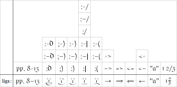
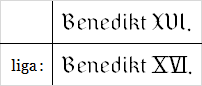
Finally, Pfeffer Simpelgotisch tries to identify Roman numerals as well as possible and to replace them with appropriate glyphs, as blackletter majuscules are little suited for this:
The feature “hist” (historical forms) causes a typeface appearing somewhat older. “Etc.” is depicted by a special character, r following round letters is replaced by its round version, and the diaeresis above the umlauts is supplanted by a small e. In English texts, ſ is also set before b and k, as it was standard in the 17th century:
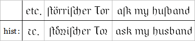
As Microsoft Word doesn’t know the feature “hist,” I’ve made it available as stylistic set “ss05”, too.
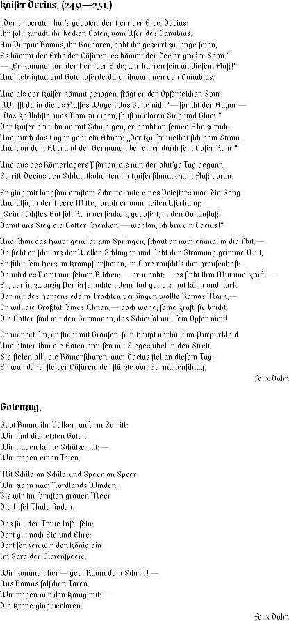
Two poems on the Goths from Franz Tetzner, Deutsche Geschichte in Liedern deutscher Dichter, Erster Teil. Von Pytheas bis Luther, Leipzig 1892, pp. 43 and 88. Set in the regular and in the semi-bold typeface.
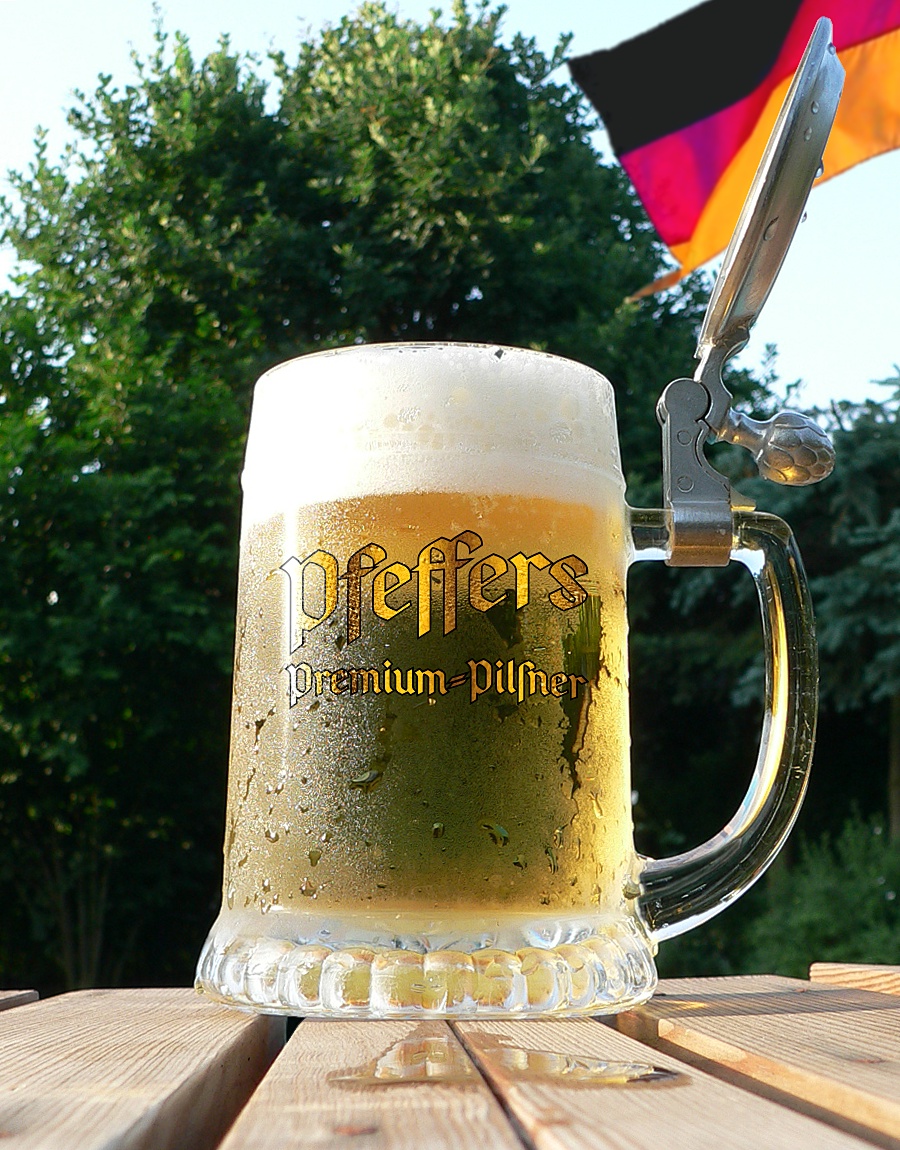
Cool beer. A Midsummer Day’s Dream! Set in the bold typeface.
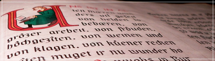
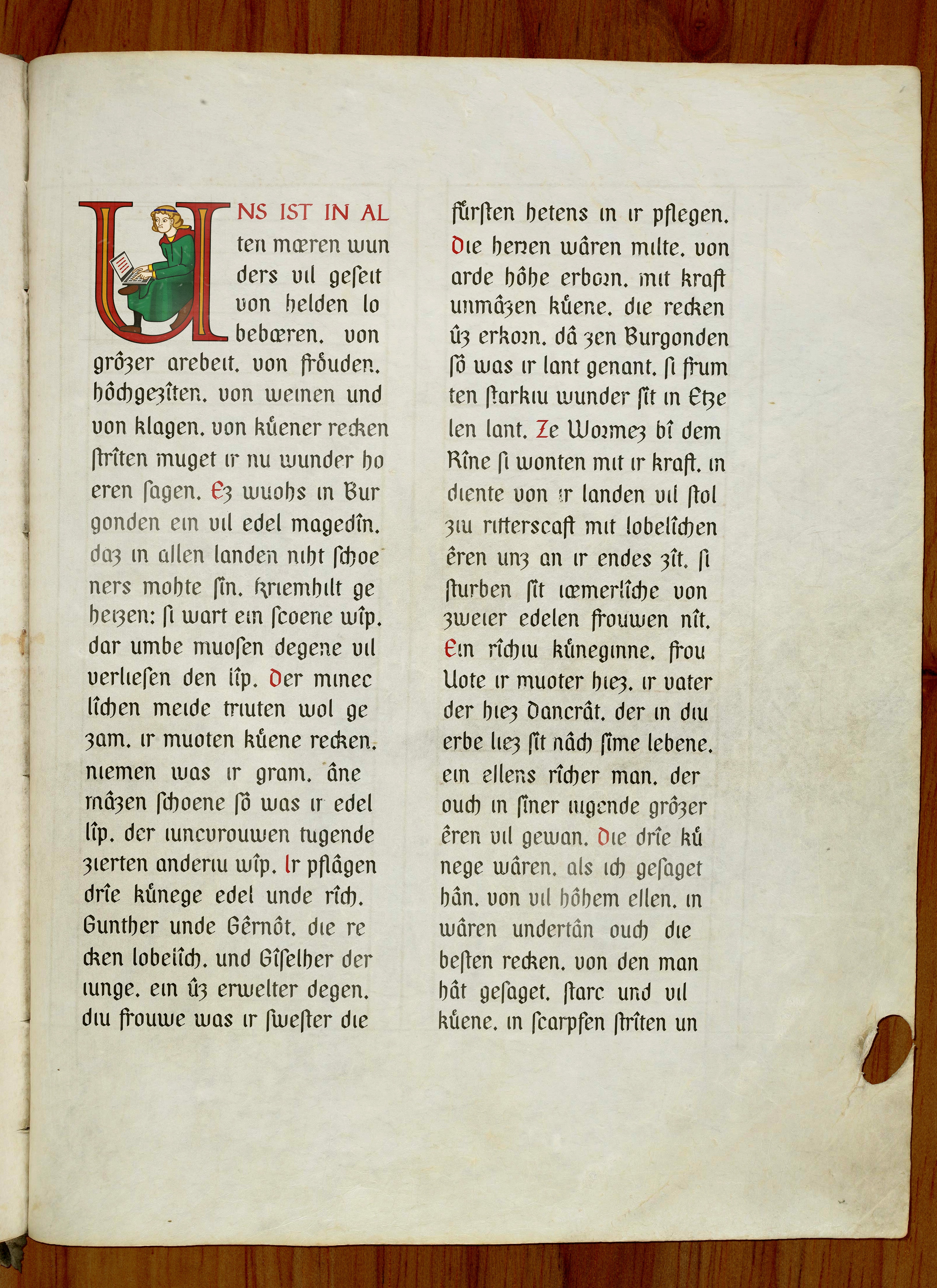
From a ‘sparsely known’ manuscript of the Nibelungenlied (text according to Karl Bartsch/Helmut de Boor (Eds.)/Siegfried Grosse (Trans.); Das Nibelungenlied. Mittelhochdeutsch/Neuhochdeutsch; Stuttgart 2002). Set in the semi-bold typeface. — As to the “inhabited initial,” see here.
Despite all efforts, automatic setting of ſ and s is still far from being perfect. So, if you find a mistake, I’d be very grateful for a brief message!
| File | Description |
| pfeffer_simpelgotisch.zip | A simple textura in three typefaces (regular, semi-bold, and bold) and with extensive OpenType features. |
| pfeffer_simpelgotisch_halbfett.zip | The semi-bold typeface as a separate font family (because of Microsoft Word). |
* Perpetual application of the OpenType rules will of course slow down text rendering as well as the system itself to a certain amount. I can’t totally exclude that older systems might prostrate having Pfeffer Simpelgotisch as a system font! Hence, use it at your own risk.
